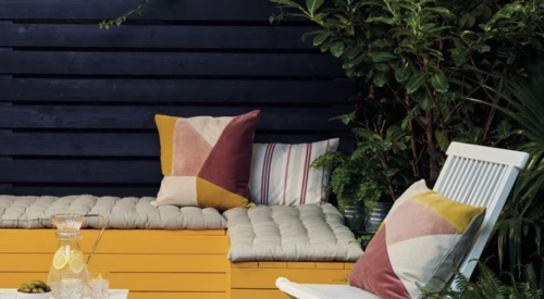
Natalie Jones, founder of Caro, a design and lifestyle shop, explains how dark, modern colors transformed her 18th century home.
Jones used four different colors from Farrow & Ball, a premium British paint manufacturer: De Nimes, a dark blue, Hardwick White, Bancha, a dark olive color, and Railings, a blue-toned alternative to black paint.
“I always think you should follow your heart when it comes to color because if you don’t feel the color or are drawn in by it, you’re not going to love it,” Jones says. “If you’re going to use color, I would say be bold.”
[Related: NEOLITH SURFACING BRINGS DRAMA TO A FLORIDA KITCHEN]
Because Jones’ house was a historical restoration, she wanted to pay homage to its origins with a somber, neutral color palette in the upstairs, using the Hardwick White to paint the bedrooms. For the downstairs extension, which includes the family room and kitchen, Jones wanted to go more modern and choose a dark green and blue for the design. Large custom windows allow swaths of light into the open-concept floor plan, which changes how Jones and her family experiences the paint.
“As the light shines on it, the pigment really comes out and you can tell it’s this deep green,” Jones says. “So light is really important to kind of grow with the color and appreciate it at different times of day.”
Learn more about Jones’ design decisions by watching the video.
[Related: TIPS FOR THE 2020 BENJAMIN MOORE COLOR OF THE YEAR]
Transcript:
For me, home is escapism from the rest of life.
I try and surround myself with things and environment space that make me feel me. I am Leslie Jones, and I am the founder of Carrow, a brand for life and home. We are in Bruton, Sunset, my main reason for coming here was initially to be with my husband. But now the main reason is I just love being here and the people, the community.
The house is an 18th century grade 2 listed building. It was a bit of a disaster so we decided to just strip everything back and start again and put our own sort of stamp on it. Upstairs, that’s the historical site. So I wanted to be true to the history and bring a soberness to the color palette. I wanted upstairs to have a neutral pallet.
[Related: 7 CLASSIC BLUE PRODUCTS TO CELEBRATE PANTONE’S 2020 COLOR OF THE YEAR]
So all of the bedrooms have a sort of tone to them. Downstairs where the extension is, I wanted to be a bit more playful and keep it in modernity, so we went for a very dark color. As the light shines on it, the pigment really comes out and you can tell it’s this deep green. So light is really important to kind of grow with the color and appreciate it at different times of day.
Ollo and I tend to spend a lot of time here. I can cook while I look over him, and we entertain in this room, so it really is the hub of the house. I always think you should follow your heart when it comes to color because if you don’t feel the color or are drawn in by it, you’re not going to love it. If you’re going to use color, I would say be bold. What’s the worst thing that could happen? You paint over it!


