Each year the color experts at paint companies pick the hues that they believe will rule the design world for the following 365 days, dubbing them “Color of the Year.” We looked at 10 shades that have already been chosen for 2019.
The Color of the Year choices span from deep greens to earthy reds, but collectively they say something about the climate, trends, and needs of our time. When defending their choices, many manufacturers mentioned the importance of returning to nature and disconnecting from a busy digital world. This need was reflected in a number of earthy, leafy, and otherwise nature-inspired tones.
READ: 24 SURFACING PRODUCTS THAT WILL STAND OUT IN A CROWD
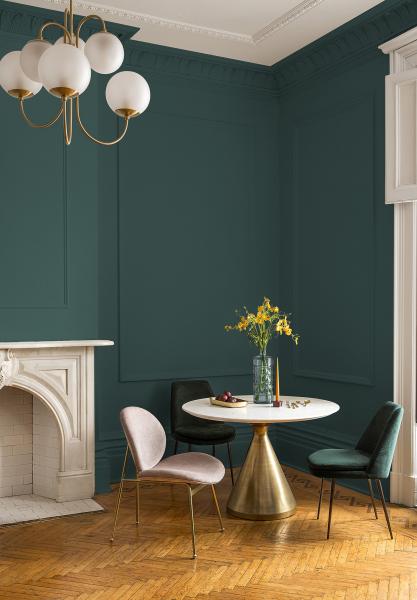
“The restorative power of nature is important in society now more than ever,” says Dee Schlotter, PPG’s senior color marketing manager. The company’s Color of the Year choice, the rich green Night Watch, “pulls our memories of natural environments to the surface to recreate the calming, invigorating euphoria we feel when in nature,” she continues.
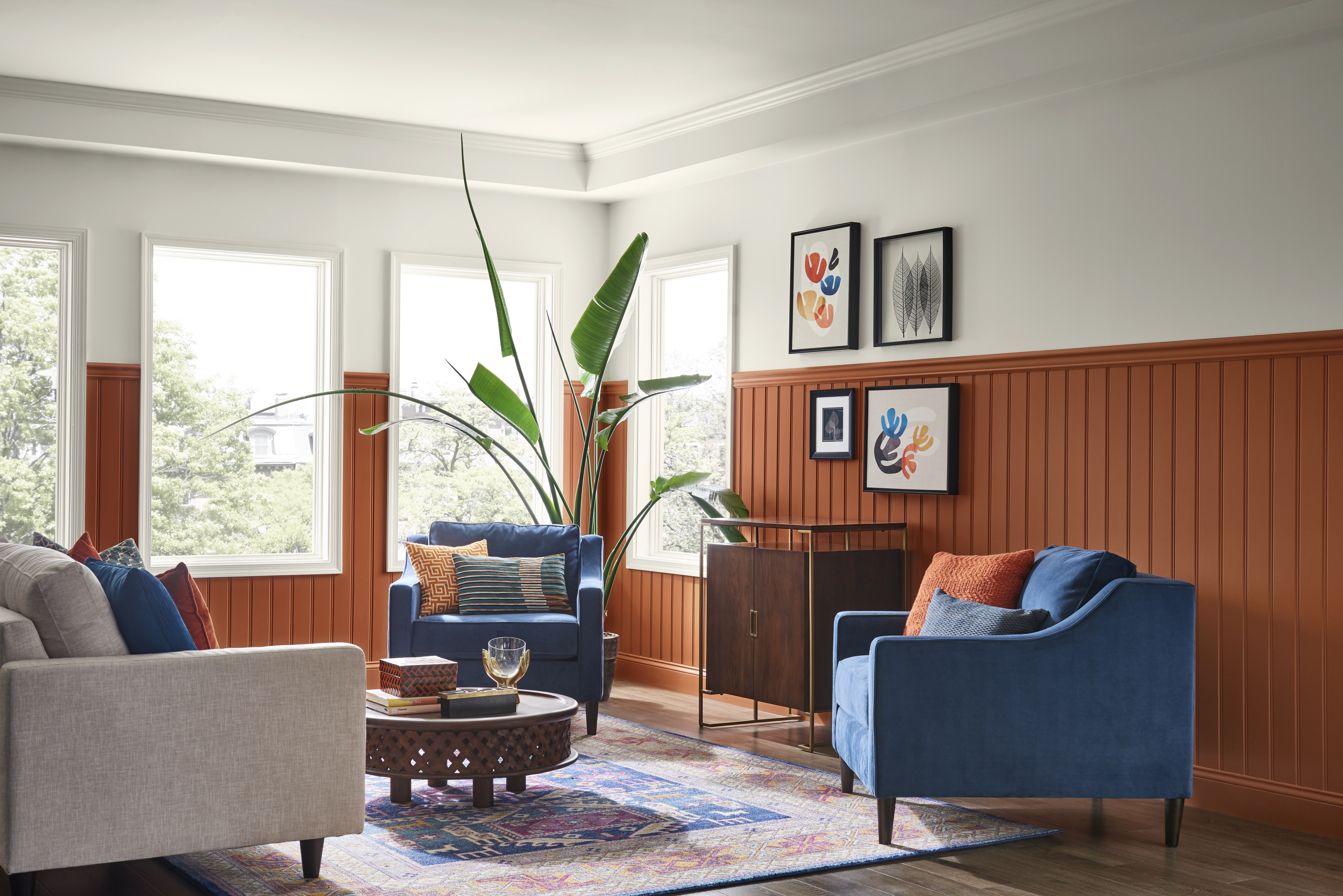
Natural elements cropped up again in Sherwin-Williams’ and Dunn-Edwards’ picks, two different shades of earthy orange-brown. Dunn-Edwards says its choice reflects “a movement away from cooler hues toward more earth-inspired colors reminiscent of Naturalist motifs, Bohemian moods, the great American West and an anticipation of exploring the red planet, Mars.”
Sherwin-Williams points out that, beyond it’s earthy connection, its orange is a modern take on the popular 1970s hue and a nod to the reemergence of midcentury modern design motifs.
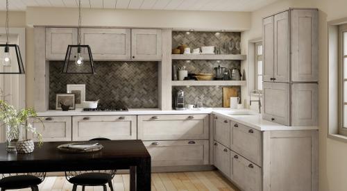
Several companies, including Behr, Diamond Vogel, and Kelly-Moore, chose deep blue tones, which encourage mindfulness, calm, and comfort, the companies say. The blue hues play nice with both warm and cool colors, says Dunn-Edwards, and are “becoming a favorite color for modern kitchen cabinetry,” according to Kelly-Moore. Blues can act almost as neutrals, creating a base color for a space.
Benjamin Moore was the only major manufacturer to choose a true neutral for its 2019 Color of the Year, picking its cool gray Metropolitan shade. The company says the color reflects both comfort and sophistication.
“It’s a color in the neutral spectrum that references a contemplative state of mind and design,” says Ellen O’Neill, Benjamin Moore’s director of strategic design intelligence. “Not arresting nor aggressive, this understated yet glamorous gray creates a soothing, impactful common ground.”
Check out these hues and more in the 10 Colors of the Year listed below.
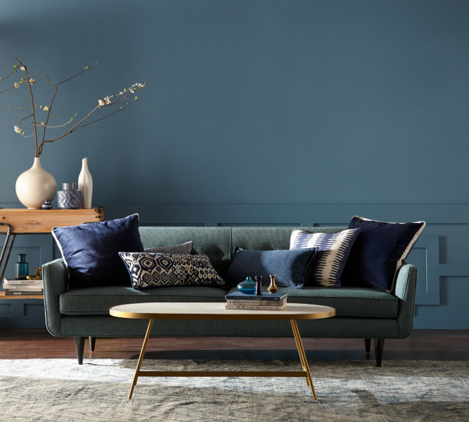
1. Behr, Blueprint
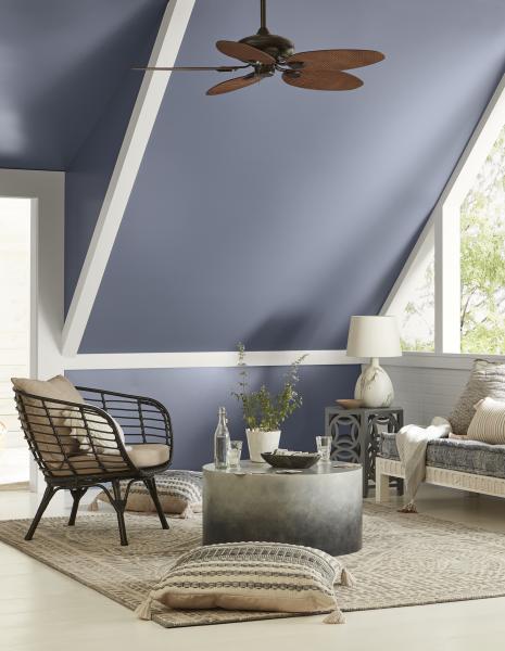
Blueprint is a mid-tone blue that is “warmer than denim and softer than navy,” Behr says. It is meant to be a strong base for designers and homeowners to build a room around. The company has also released four palettes to compliment Blueprint, including the all-blue Color Binge, the nature-inspired Down to Earth, the pastel Soft Focus, and the jewel-toned Inspired Curation. “This universally appealing hue provides a steady stream of positivity and is poised to be an instant classic for years to come,” says Erika Woelfel, vice president of color and creative services at Behr.
2. Valspar, Angelic Blue and Seattle Haze
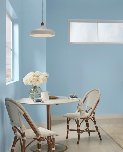
For the past 10 years, Valspar has chosen to release a curated palette of 12 Colors of the Year, rather than choose just one. Joining the ranks this year is the fun and breezy Angelic Blue (left), which has a “weightless quality” that “seems to push past the walls and welcome” one into a space. Seattle Haze (right), blends blue, purple, and gray for a quiet and thoughtful shade. See the collection’s 10 other shades, which span from a bright orange to a subdued green, at askval.com.
3. Sherwin-Williams, Cavern Clay
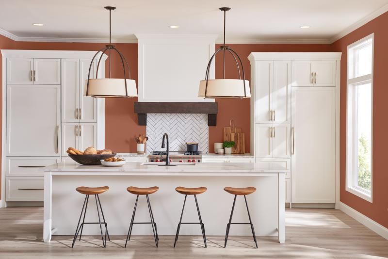
The earthy, terracotta color is a reference to mid-century modern style, the American Southwest, and a “desert modern aesthetic.” The tone is warm and natural and pairs well with warm grays or deep browns, as well as blues and greens, the company says.
4. Benjamin Moore, Metropolitan
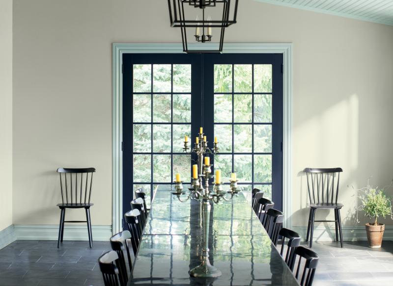
Metropolitan is a light gray color with cool undertone that can calm and quiets a space, the company says. “Comforting, composed and effortlessly sophisticated, Metropolitan AF-690 exudes beauty and balance,” says Ellen O’Neill, Benjamin Moore’s director of strategic design intelligence. The manufacturer also put together a palette of 15 corresponding hues, including neutrals, pinks, blues, and greens.
5. PPG, Night Watch
The experts at PPG believe that the most impactful color trends in 2019 will be tied to nature, which is why they named this lush green tone was chosen. “Night Watch is about bringing the healing power from the outdoors into your home through color,” says Dee Schlotter, PPG senior color marketing manager. The color was chosen during PPG’s annual Global Color Workshop, which brings together designers from the automotive, consumer electronics, aerospace, and home paint industries to find colors that will resonate across cultures in the coming year.
6. Dutch Boy, Garden Patch
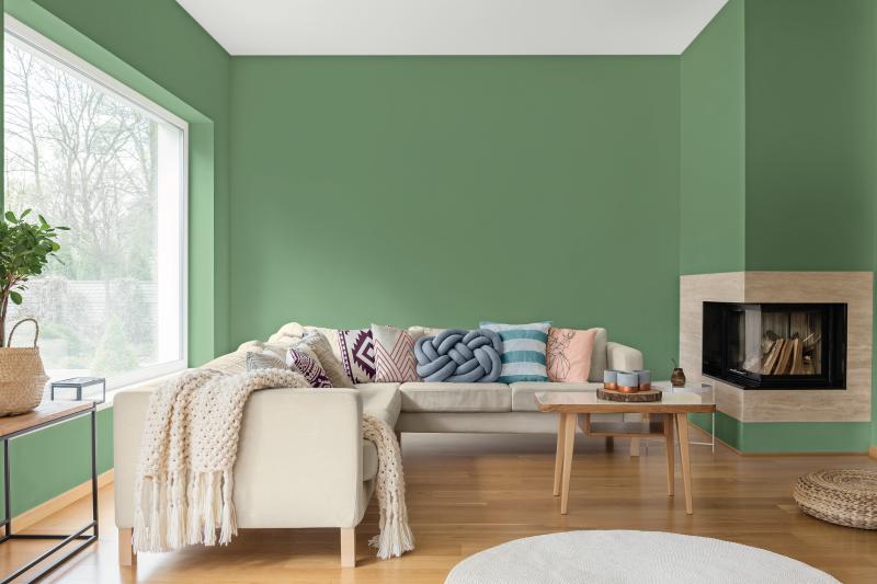
Dutch Boy’s botanical green choice reflects “a happier, more empathetic country seeking greater peace and understanding while celebrating diversity,” the company says. The color is a part of the company’s Homestead palette, one of three color collections curated for 2019. Garden Patch, along with the three palettes, are all designed to have a happy and warm tone.
7. HGTV Home by Sherwin-Williams, Reflecting Pool
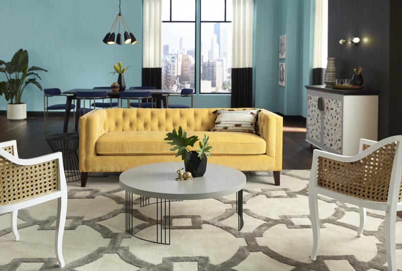
Reflecting Pool, HGTV Homes’ color of the year, is a part of Sophisticated Whimsy, one of the company’s three color stories for 2019. The manufacturer says that Sophisticated Whimsy “encourages adventure sought through openness and positivity.” It is joined by the digitally-inspired Mystic Light and the soft and neutral Everyday Balance collection.
8. Kelly-Moore, Peacock Blue
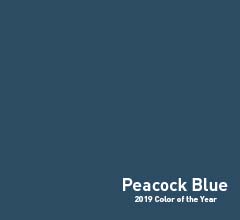
Kelly-Moore’s Peacock Blue was chosen as color of the year through a survey of 15,000 ASID-certified interior designers and members of the American Society of Interior Designers. The color can “optimize concentration, encourage deep meditation and even improve sleep,” says Mary Lawlor, manager of color marketing for Kelly-Moore. The deep tone can act as a neutral replacing black and white on kitchen cabinets and walls.
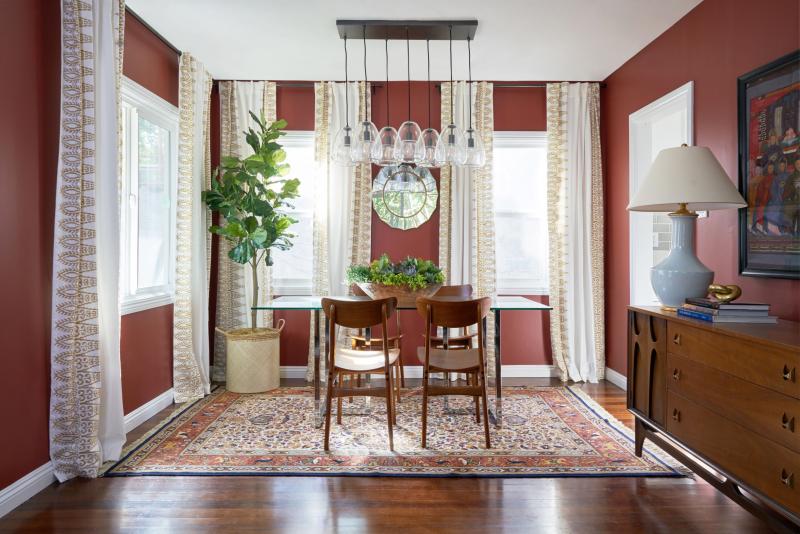
9. Dunn-Edwards, Spice of Life
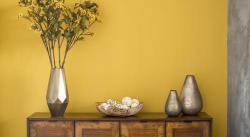
Spice of Life, a red-brown brick color, was selected “after extensive research on color trends in everything from art, hospitality, and fashion to global events and local street culture,” the company says. The nature-inspired hue is reminiscent of autumn, the American West, and naturalist paintings from the 19th and 20th centuries.
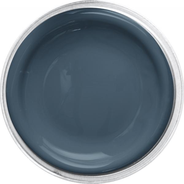
10. Diamond Vogel, Day Spa
Day Spa is a saturated navy blue that pairs well with neutrals and other nature-inspired colors. The hue is calm, timeless, and introspective, and was designed to create comfortable spaces. It is part of Inner Shift, one of the manufacturer’s three 2019 color stories, which encourages users to slow down in a world of fast-paced technology.
