The process of selling a house begins months, if not years, before a prospective buyer contacts a builder. What’s more, a broad range of specialties is required to take a house or a community from concept to reality.
Architectural design, interior merchandising, advertising collateral, signage, sales centers, websites, special promotions and events, and landscaping all factor in. Social media has taken on increasing importance, too.
A great marketing campaign is about more than nifty graphics and catchy slogans. It’s about results. On the pages that follow are award-winning examples of branding, community amenities, marketing materials, and design center concepts from The Nationals, the NAHB’s National Sales and Marketing Council’s awards program. All offer inspiration for successfully selling a variety of products in all kinds of markets.
 EYA video, accessible on the company’s website and on YouTube
To sell diverse offerings, craft a consistent package
What looks like a TV commercial by Bethesda, Md.-based builder/developer EYA, isn’t a TV commercial at all, but a corporate branding message that sets the tone for everything the company strives to be: a developer of green, infill communities in the metropolitan Washington, D.C., region.
The video lives on the company’s website and on YouTube, and it does some heavy lifting, helping potential buyers understand EYA’s focus on walkable neighborhoods that foster community. But the segment also helps explain the company’s vision to land planners and government agencies during the entitlement process. It’s such an effective tool, in fact, that EYA’s land acquisitions team takes it with them when they talk to potential sellers.
“It’s a thoughtful way to live; it’s the right way to live,” says Preston Innerst, EYA’s vice president of sales and marketing. “The more times they hear it, the more they can understand why we do what we do.”
EYA does infill, which translates to a diverse portfolio and also poses a challenge when it comes to expressing a cohesive idea of what the company is trying to achieve. So instead of shooting video of communities that EYA has built, it chose animation. The images convey the company’s mission and approach without identifying specific neighborhoods that may or may not be familiar to the audience. “It simplifies a complex process,” Innerst says.
“It was the first time the company had produced a video of who we are and why we do what we do,” Innerst says, and that reflective process proved to be both educational and energizing, so much so that it has extended to other business processes. “The process of making the video reminded us of what is most important in choosing new communities and sites, ensuring that we as a company are able to execute on the brand promise—‘Life within walking distance’—that is captured so well in the video.”
 The Shed
For community spaces, flexibility comes first
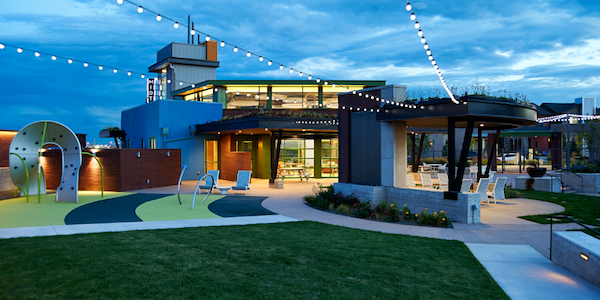
When Denver-based Duet Design Group got the programming list for The Shed, the clubhouse for Brookfield Residential’s Midtown community, it included uses such as birthday parties, wine tasting clubs, morning coffee get-togethers, football parties, and community events. “The list was really long,” notes Duet Design Group Principal Miranda Cullen. Yet the space itself is just 1,461 square feet in a tiny, yet pivotal, corner of a 5-acre site that includes a community garden, a playground, and a dog park.
The small square footage of the building is intentional, says architect Lee Payne, from Boulder-based DTJ Design. A large focus of the community is on outdoor amenities, especially the community garden. “This is really just a large gathering room,” Payne says. “The intent is that big events would be held outside. To foster connection with the outdoor space, overhead garage doors were installed, and in nice weather, you can throw the doors open.”
As the first building that prospective buyers, homeowners, and neighbors see as they drive into Midtown, The Shed sets the tone. Built on a remediated brownfield near downtown Denver, the architecture speaks to the site’s industrial past. Materials include precast concrete, exposed structural steel, brick, and reclaimed wood. With so many possible uses for the space, furniture was designed to be easily moved and reconfigured. Tables are on casters, and chairs can be mixed and matched.
Concrete floors (a departure from the hardwood floors in most Colorado community clubhouses) and ceiling heights near 15 feet (another nod to the location’s industrial past) presented a challenge where sound is concerned. The solution: Round acoustical clouds were hung from the ceiling to cut down on noise. “Figuring out the sound issues was one of the biggest triumphs,” Cullen says.
An important best practice gained from the project, Payne says, came from understanding the importance of thinking through the details from every aspect, including civil engineering, landscaping, lighting, and design. Weekly meetings helped ensure that nothing slipped through the cracks.
Payne applauds Brookfield Residential for its trust in the design team. “The owner never put handcuffs on our creativity,” he says. “They did a great job. It was a super-creative, really fun project, and that shows with the sales. It was the hottest neighborhood in the Front Range for a long time.”
 The identity for Anaheim’s The Domain is that of an urban townhouse community geared to young buyers attracted to living downtown
To market a vibrant vibe, keep it simple and compelling
Graphic continuity keeps everything in a marketing effort tied together to support a community’s identity. The identity established for The Domain, located across the street from the Anaheim Packing District, a shopping, dining, and entertainment destination in Anaheim, Calif., is that of an urban townhouse community geared to young buyers attracted to living downtown. Its marketing materials needed to be hip, fun, and engaging. Unlike many projects, The Domain was easy to promote. Sandy Keedy, president and creative director of the project’s ad agency, Hayes Martin Associates, says that the biggest challenge was having lots to talk about and not much space to do it in.
From brochures and newspaper ads to fence wraps, signage, and swag (tote bags and T-shirts), the message was told with playful fonts, bright colors, and strong visual icons, such as a bicycle, a bathing suit, a guitar, and a coffee cup on a background resembling the chalkboards common in contemporary cafés. “Orange and turquoise contrast well with the chalkboard,” Keedy points out. “We knew we’d have a variety of marketing tools—on-site, online, and environmental—and we wanted them to have an impact. The signage really brought it all to life.”
Lifestyle messages were kept short and sweet: Live here. Walk here. Chill here. Grow here. The overarching banner was “Live in the Center of Attention.” Postcards played off the name Domain, with slogans such as “Where you live is what you DO.”
Once created, the visual expression had a life of its own, Keedy says. “It’s the sign of great graphic direction: the ability to morph into different marketing touchpoints without losing sight of a core personality.” The lesson learned was the importance of having a platform of color, icons, and fonts in an ad agency’s library to maintain consistency from start to finish. “Those really demonstrated and captured the personality of the place,” she says.
 Marketing promo for Line K, a new line of modern luxury homes designed by Dutch architect Piet Boon.
If you have the database, leverage it to the max
When you’re introducing a new style of home, it makes sense to use an expansive format to explain what you’re doing and why it’s cool. That was the case with Line K, a new line of modern, minimalist, luxury homes designed by Dutch architect Piet Boon for K. Hovnanian Homes that has already been successful in the Phoenix market.
Phoenix is a market known for embracing modern architecture, so Line K was well received. But a more traditional aesthetic prevails in the suburbs of Washington, D.C. So for a 4,000-acre master planned development in Willowsford, in Loudoun County, Va., the campaign began with a postcard mailed to about 4,800 prospects who had expressed interest in the homes.
“We used the database to refine the list of potential prospects,” says Fraser Wallace, chief executive officer of ad agency Wallace & Company, in Dulles, Va. “Then we used that model and purchased additional names. We knew the geographic, demographic, and psychographic; we were looking for people tuned into contemporary homes. Based on that, we sent out the teaser postcard.”
The really special part came next. Wallace & Company is responsible for producing Inspired, a lifestyle magazine for the Willowsford community. To introduce Line K, a 50-page special edition was devoted to showcasing the line of homes.
“When you ask someone to spend $1.5 million, you need to stand out,” Wallace notes. “The magazine let us tell the story of Piet and the product, and to create a coffee-table book to get passed around. We know four couples who used the same magazine to learn about the project.”
A primary goal of marketing is to engage buyers, and the magazine accomplished just that, Wallace says. At an event to celebrate the neighborhood’s sell-out (accomplished in just nine months), people were bringing the magazine to have Piet sign it. “The biggest lesson learned,” Wallace says, “is the importance of a robust mailing list. The database was critical. That allowed us to go in and spend the money to communicate the product, and the client was willing to spend the money to do a magazine.”
 Toll Brothers design center
To draw high-end buyers, take cues from high-end retail
Toll Brothers has a reputation for traditional design, but when the builder entered the Orange County, Calif., market in the Baker Ranch master planned community, it was time for a more current look.
“I said, ‘Hey, we can be cool, too,’” says Toll Brothers Southern California president Seth Ring. Toll Brothers asked San Diego-based Ryan Young Interiors, a long-time partner, to create a design center that would appeal to a sophisticated California homebuyer. Tara Ryan, president of Ryan Young, has worked extensively with Chinese builders and knew just where to turn for inspiration. “You won’t find anything more upscale than shopping in Hong Kong,” she says, “where boutiques have sleek finishes and a neutral palette.”
The lobby features art niches, a reception center, and a smart table where buyers can choose from the collection of floor plans. The focal point is a pair of facing kitchens—one more traditional, with white cabinets, and a contemporary one with espresso cabinets—with a shared central island to pull it all together. “This is the evolution of Toll under one roof,” Ring says. “If you’re into traditional, we can do that, but we can also do contemporary.” A cohesive palette of materials underscores the high-end retail theme.
The center works so well that Ryan’s team is designing a similar space for Toll Brothers in Los Angeles. Having learned from the Irvine center that many of the buyers are multigenerational, Ryan says there will be increased focus on comfortable seating for people of various ages. “They’ll be there awhile making a huge purchase,” she says. “We want to make sure the environment feels stylish and comfortable for someone in their 30s or in their 60s.”
