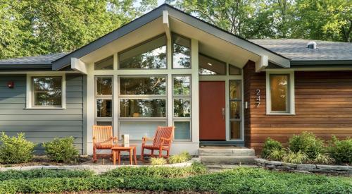
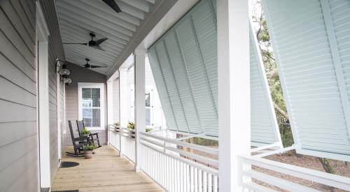
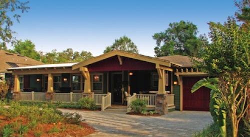
| Porch and deck detailing, rain gutters, light fixtures, landscaping and other home accents provide opportunities to enhance the entire exterior (above photo). Color blocking (varying shades on the gables, main portion and lower areas of a home) is a perfect way to vary the elevations of homes clad in vinyl (below photo).
|
Buyers expect and deserve a lot from their homes. After all, the true nature of a house is to provide more than just shelter; people want warmth and an enriching and nurturing environment. And the sophisticated home buyers of today--most of whom are very educated about the buying process--are demanding exterior designs that reflect their own sense of individuality. In other words, they want their house to look as perfect as possible.
More and more, color palettes directly influence today’s cognizant buyer, and exterior merchandising is becoming as important as interior merchandising. Builders across the country are catching on to this already enormous and still growing marketing trend. Many have made it a benchmark issue and fully integrated it into their marketing plan, hiring consultants, designers and forecasters to oversee the process of color merchandising.
Miriam Tate, based in Costa Mesa, Calif., is one in-demand color consultant who has worked for Del Webb, Pulte and other builders.
"Builders can’t afford not to pay attention to the visual power of well executed exteriors," says Tate. "It’s no longer an option--it is a necessity."
| A copper roof on a bow window, millwork and creative stonework add pizazz to a monochromatic color scheme.
|
Builders who are paying attention are noticing definite color trends emerging, some regional and some nationwide. These trends are influenced by everything from fashion to the automotive industry, but they are most directly influenced by the architecture of the home.
"We’re getting a lot of our inspiration [for exterior colors] from European architecture and the resurgence of Frank Lloyd Wright designs," says Carole P. Eichen, president of Carole Eichen Interiors, Inc., Santa Ana, Calif. "A lot of today’s homes need an extra infusion of color because their architectural style demands it."
Tate agrees that home color trends always go with the architectural trends. She says that English Tudor style homes demand a blue-based color palette, while an Italian Mediterranean home requires a yellow-based color palette.
"Now we’re in a situation where we have a lot of popular styles that are both blue- and yellow-based, so we’re getting a true semi-custom streetscape and a balance between color schemes," says Tate.
Many people are choosing either brighter or warmer tones from these palettes; in short, they are opting for more color. "Colors are becoming much stronger, such as melon tones with brown accents, and a lot of greens--especially on concrete tile roofs--on buildings with melon and peach tones," says Eichen.
Pat Verlodt, another color consultant and past president and lifetime member of the Color Marketing Group, an association of 1500 color designers who identify color trends for all industries, reinforces the observations of Tate and Eichen.
"Many people are even applying ‘chameleon colors’ to their homes--colors that take on a different shade in certain types of light," says Verlodt.
There are also regional color trends: purple tones in California, pinks, pastels and peaches in the Southeast, adobe and brick hues in the Southwest, a mix of medium and dark colors in the Midwest, and blues and grays on the Atlantic Coast and in the Northeast.
"We’re even starting to blend deep cinnamon, golds and mustards in the Northeast," says Eichen. As more color comes into these markets, it raises the level of color interest in each area; buyers become even more educated and experienced.
Put It All Together
Builders have often found it difficult to provide enough color variety and imagination for buyers, because high demand often demands high efficiency and that often results in a lot of repetition. But production efficiency does not always have to mean replication, as there are ways to efficiently produce neighborhoods where each home boasts an individual style. Many builders offer a number of different exterior designs for each of their plans, and two houses with the same footprint can be produced relatively easily with completely different color schemes.
Builders have also been hesitant to capitalize on color trends because if the color scheme of a house suddenly becomes passe, it can be difficult and expensive to change it. People don’t want to be saddled with a periwinkle roof because it was the hot color of 1985, and no one wants to replace their siding after only five years of use, even if it is that shade of teal that was all the rage in Europe a few years ago.
Aside from the necessity of avoiding fleeting trends, another important thing to remember, according to Verlodt, is that the exterior color has to work in harmony with the entire house.
"You have to ask yourself, can you make it work in vinyl, and will the color go with the brick and stone? And while peach may look great on stucco, it looks terrible on cedar," Verlodt says.
Vinyl siding color schemes can sometimes be tricky, since color options in vinyl are relatively limited. To effectively provide a varied and attractive color scheme with vinyl, Tate uses color blocking. This entails using different colors on gables and the lower area of a home, and often mixing in stone or brick accents. Tate used this technique at Del Webb’s new Sun City Huntley, just north of Chicago, and buyer response has been more than positive.
"Color blocking breaks down the scale of the houses and even the entire development, though not all elevations are conducive to color blocking," says Tate.
Just because an elevation isn’t conducive to color blocking, or siding and roofing materials narrow your color schemes, that doesn’t mean you’re out of options. Doors and shutters are perfect places to put a splash of bright color, and if the color seems unappealing in a few years, they are easily changed. Light fixtures, millwork, porch railings, and window colors are some of the often-overlooked but most important opportunities to enhance a home’s exterior color scheme.
"It is extremely important to pay attention to exterior details," says Eichen, "Even something as simple as a small wrought-iron rail around a balcony can add so much to a home’s color scheme and appeal."
Tate also argues the merits of the little things, such as brass kickplates or door knockers. "Builders shouldn’t be afraid to go for the ‘delight quotient’ by providing little unexpected touches, such as a sky-blue or robin’s egg blue porch ceiling."
Color consultants such as Tate are often the only consultants to work with every other component of a development, because color schemes have to work in harmony with every aspect of the community. "It can be the most complex undertaking if done right," says Tate.
While this much attention to color does not usually increase a builder’s hard costs, it does increase planning and supervision costs. Those builders who do it right, however, are finding it to be a worthwhile investment, giving their homes more presence, individuality and a sheltering tone--in other words, more targeted consumer appeal.
Also See:
Capitalizing on Color Not Only for Production Builders


